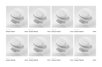
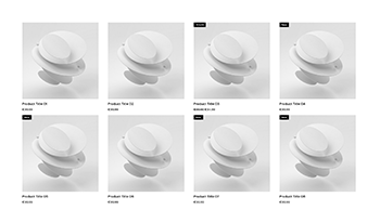
Creative Elements 2.5.10 : Introducing Product Miniature Builder and Dynamic Tags

We're super excited to introduce our latest Creative Elements update to bring you a ton of new features — making store building with PrestaShop even easier and a lot more consistent.

Product Miniature Builder

It’s time to meet our brand new, fully editable building block for your shop — the Product Miniature. The product miniature is one of the most commonly used element in an online store, usually found in product listings, category pages, brand pages, product carousels and also search results. Now you have the option to build your own custom version with various widgets using the Product Miniature Builder (aka. Loop Builder).

Default slide up – Product Miniature
Slide in center – Product Miniature
Push up center – Product Miniature
Slide in right – Product Miniature
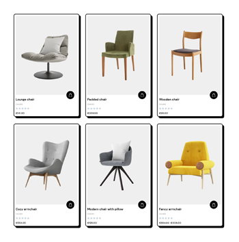
Rounded slide in with icons – Product Miniature
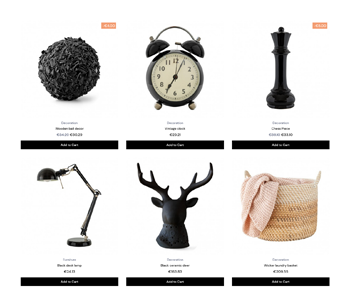
Neo brutalist – Product Miniature
Inline with icons – Product Miniature
Scale in with icons – Product Miniature
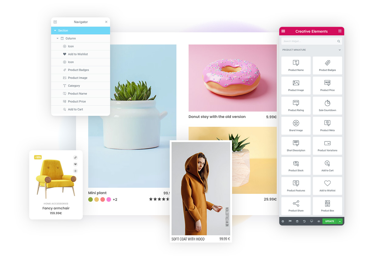
Product box based – Product Miniature
Floating info on left – Product Miniature
Floating info on right – Product Miniature
Rounded dark floating info – Product Miniature
Wireframe – Product Miniature
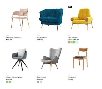
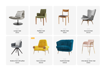
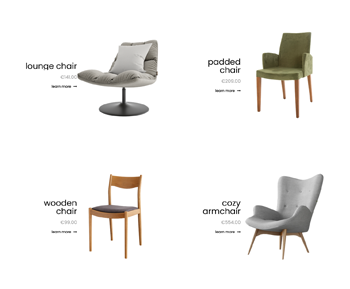
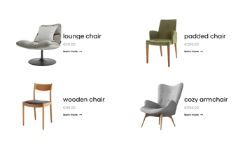
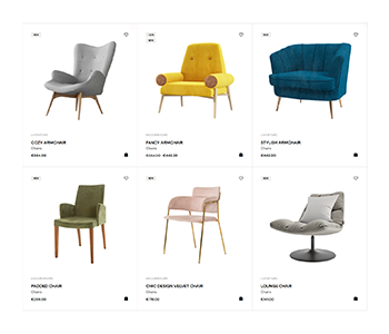
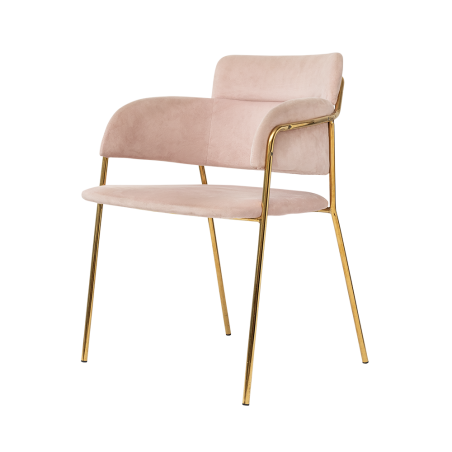
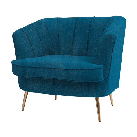
Furniture – Product Miniature
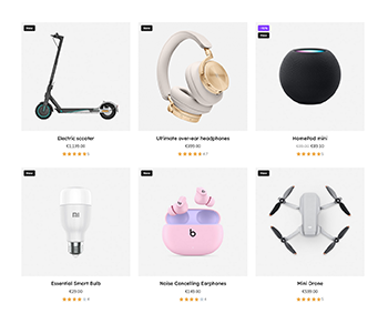
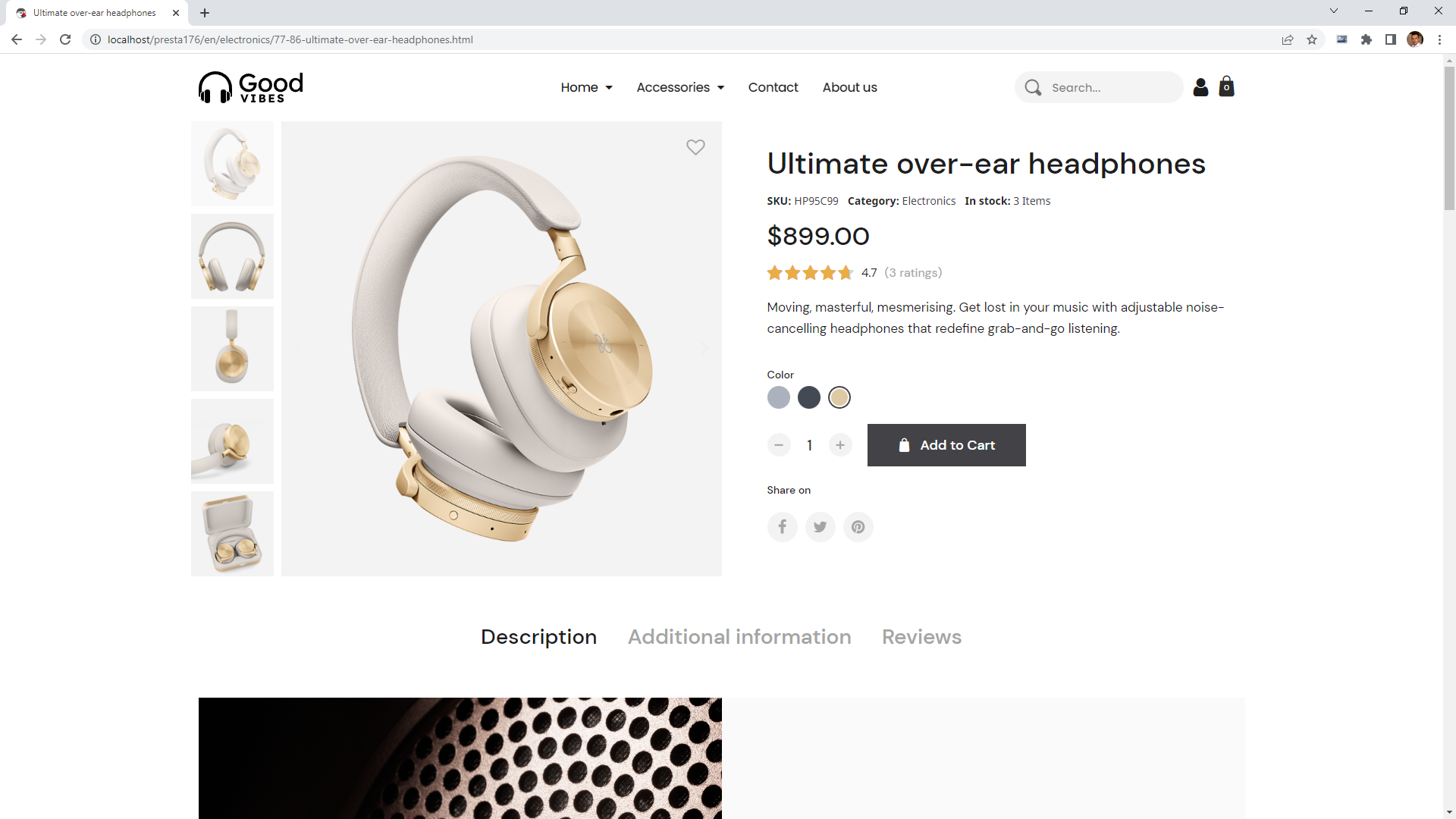
Electro – Product Miniature
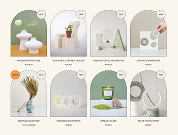
Handmade – Product Miniature
Interlocking Grid – Product Miniature
Skincare – Product Miniature
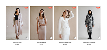
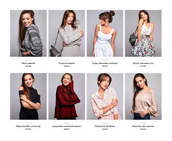
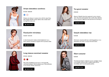
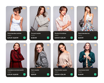
Mode – Product Miniature
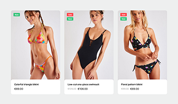
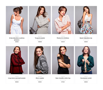
Minimal Fashion – Main Product Miniature
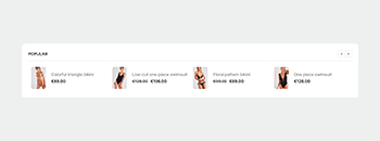
Minimal Fashion – Inline Small Product Miniature
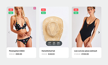
Minimal Fashion – Countdown Product Miniature

Dynamic Tags

Creative Elements already contains dynamic elements like Product Boxes, Product Carousels, Product Grids, or widgets that meant to create a product page or header with. Using the new version, you can also dynamically display content in other static widgets with the Dynamic Tag feature, giving you functionality you've never had before.

Dynamic Tags can be divided into two groups: one for displaying dynamic content (such as images or text) and the other one for performing an action.

Dynamic Tags in Heading widget: center - displaying content | right - performing action

Let's look at some simple examples:

You can set an add-to-cart action on a Button widget or just simply open a lightbox.

Or create a completely unique way of navigating your product carousels that you never imagined before. In the example you see below, two Icon widgets are used for navigation events (left and right) — the system automatically finds and controls the carousel closest to it.

New Arrivals

Click edit button to change this text. Lorem ipsum dolor sit amet, consectetur adipiscing elit. Ut elit tellus, luctus nec ullamcorper mattis, pulvinar dapibus leo.

Product Page improvements

The product page has also undergone some major improvements to increase user experience and design.
In the product lightbox, you have the option to zoom in on the product image using touch gestures on mobile and double clicking on desktop. It is also possible to display a counter, showing the customer the number of images they can see for each product.

In the Product Image widget, you have the option to zoom in on the product image by hovering over it.

Play Video

Due to the fact that widgets' width can now be set by calculation, you can also use the calc function to arrange several different items in a row to get the maximum out of the available space.
Here's an example: put a product quantity input field in front of the 'add to cart' button, followed by an 'add to wishlist' icon. In this case we can adjust the width of the button to fill the available space dynamically with calc(100% - 70px - 40px). (70px is the width of the input field and 40px is the width of the icon.)

Header improvements

The header is a highly-packed area in a webshop, adjustments are needed. To save space, we've added a new feature to Sticky Position: now it disappears on scrolldown, and reappears on scrollup.

The widget width calculation enhancement can make better use of the space in the header, so that - for example - the navigation menu could use the area dynamically.

We have added another useful improvement that allows you to reorder widgets on different devices. With these new features, we have the possibility to reduce the size of the DOM, improving loading speeds even more.

Play Video

Hover transform reworked

This enhancement was originally intended for Product Miniatures, but we figured we could extend it to all areas. It allows you to trigger transitions on various widgets by hovering the mouse over a section or column. And now you can also adjust the opacity of the widgets in the transformations. Cool, isn't it?

You have probably guessed that you can craft some pretty special call-to-actions, but I'll show you some examples:

Your custom product

Your custom product

Drink Juice

Stay fresh

Click edit button to change this text. Lorem ipsum dolor sit amet, consectetur adipiscing elit. Ut elit tellus, luctus nec ullamcorper mattis, pulvinar dapibus leo.

WebP support arrived

As you probably know, the loading speed of your website plays a crucial role in projecting a great first impression. Visitors prefer faster online stores, so don't let them wait! The easiest way to improve the speed of your page (besides various code optimizations) is to use images with the right dimensions and compression.

It's always recommended to compress your JPEG or PNG images with https://compressor.io/ or https://tinyjpg.com/.

We now say that the global compatibility of WebP has reached a new level. From now on, we are allowing you to use it in your content to build with Creative Elements.

In addition to these improvements, there's much more you can read about in our changelog: